Cinerama
Projeto de: Abril - Julho de 2022
Minha função: Product designer de todo o projeto
Obs! Telas e alguns processos estarão em inglês, uma vez que foram feitos no curso Google UX Design Certificated.
Visão geral
Cinerama é o estudo de caso de um aplicativo que facilita venda de ingressos de cinema, entregando um meio de evitar filas, escolher filmes e cinemas e comprar antecipadamente seus snacks e ingressos.
Objetivo
Observando as frustrações que ocorrem no processo de assistir a um filme no cinema, onde a tecnologia sempre foi motivo de vantagem, procurei a prática que melhor poderia aliviar estes pontos de dor para o usuário.
Desafios
-
Criar um meio de auxiliar usuários a reservarem filmes e assentos;
-
Desenhar uma interface coerente para usuários experientes ou não;
-
Oferecer uma experiência de compra concisa e linear;
-
Criar uma interface focada na compra do ingresso, mas que agregue outras funções úteis.

Entendendo o usuário
Para esse projeto, conduzi a base da pesquisa através de desk research (revisão literária) para um panorama geral do mercado. depois, os dados foram aprofundados durante o projeto de forma qualitativa com personas e jornadas de usuário que mais tarde se provaram eficazes para o processo.
O começo do projeto começou com perguntas básicas como: "quem é nosso usuário?", "qual sua necessidade?", "como melhorar sua experiência no fluxo de compras?". A partir daí, os dados da revisão literária contribuíram para formar dois grupos de usuários que foram traduzidos em personas.
PERSONA PRIMÁRIA

Mariana
37 anos
Gerente de MKT
Mariana é uma mãe que trabalha fora, mas valoriza algum tempo de qualidade com seus filhos pequenos e marido, mesmo que precise dedicar muito tempo e energia em sua carreira como gerente de comunicação.
Objetivos
-
Levar os filhos para uma programação diferente
-
Descansar enquanto os filhos se divertem
-
Criar memórias positivas paras as crianças
Frustrações
-
Encarar filas com crianças pequenas
-
Indecisão com filmes e assentos
PERSONA SECUNDÁRIA

Ricardo
20 anos
Estudante de engenharia
Ricardo está no segundo ano da faculdade de engenharia, onde possui alguns amigos. Mora com os pais e é fã de filmes desde criança. Ele usa filmes para escapar da realidade por um momento e gosta do sound system dos cinemas.
Objetivos
-
Se divertir com amigos ou só sem gastar muito
-
Assistir algo novo em algum lugar diferente
-
Se distrair
Frustrações
-
Chegar cedo ao cinema para garantir ingresso ou assento
-
Esperar em filas
Análise de mercado
No Brasil, o mercado possui diversos aplicativos para cinema e/ou filmes e mais uma porção para venda de ingressos para eventos em geral. Considerando as outras funcionalidades de um aplicativo para cinemas, os de vendas de ingressos para eventos (como Sympla, por exemplo), foi considerado muito mais indireto e analisado de forma mais superficial do que as outras aplicações a seguir.
Sendo assim, em um mercado já expansivo, a análise de mercado foi muito importante para a compreensão da entrega do Cinemara onde outros não atendiam aos usuários. Para a análise, dentre os aplicativos de cinema/filmes foram considerados pelo menos um que:
1. Permite compra de ingressos em diversos cinemas;
2. Apresenta cartazes de filmes para avaliação e compartilhamento;
Com a amostragem definida, realizei análise heurística de cada um, considerando principalmente: experiência no desktop, experiência mobile, features, acessibilidade, fluxo de usuário, navegação, marca, tom (de que forma se expressa) e descrições. Dessa forma foi observado que:

Ingresso.com
-
Possui uma interface funcional, porém com falhas de códigos e acessibilidade;
-
Permite compra apenas de ingressos;
-
Possui um bom site, mas peca nas entregas mobile (web mobile ou app);
-
Tem como foco da comunicação o B2B, não B2C.

.png)
Cinépolis e Kinoplex:
-
Permite que usuários vejam promoções exclusivas;
-
Permite apenas a compra de ingressos (através do ingresso.com);
-
Experiência de usuário focada no offline.

Alfred (indireto):
-
Não permite compras de ingressos;
-
Permite compartilhar suas opiniões sobre filmes no próprio app;
-
Classifica e sugere filmes de acordo com perfil do usuário.
Início da jornada

Pesquisa feita, iniciei com o fluxo de usuário básico para servir de guia e visualização da jornada do usuário como um todo. Isso ajudou a prever alguns erros durante o fluxo e vazios que poderiam interromper a jornada ou causar insegurança no usuário.
Wireframes
Tendo em vista o userflow criado, parti então os wireframes de baixa fidelidade, levando em conta o processo de ideação nessa fase. Por conta das poucas informações em cada página, avaliei como mais eficiente pular o papel e gerar e selecionar as ideias logo digitalmente. O resultado foi o seguinte...

Localização pode mudar todas as demais informações, portanto ganha ênfase.
Navegação entre as principais funções para facilitar e encurtar o fluxo.
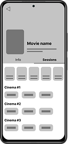
Rápida transição entre informações do filme e cinema/sessões
disponíveis.
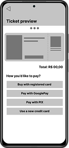
Prévia do ingresso para confirmação de compra.
Múltiplas opções de pagamento com dupla confirmação para gerar confiança ao usuário.
Com esses wireframes lo-fi foi feito um protótipo também de baixa qualidade para o primeiro teste de usabilidade. O primeiro teste de usabilidade ocorreu com uma amostragem de cinco potenciais usuários, sendo três homens e duas mulheres entre as idade de 24 a 28 e 56 a 60 anos, dois deles com filhos, podendo dessa forma validar com os usuários encontrados no estudo. O teste se deu de forma híbrida, com três pessoas de forma presencial e duas através de vídeo conferência. Os resultados nesta fase foram muito importante para incorporar mudanças e melhorias observadas pelos usuários antes do esforço de aprimorar o design. Estes resultados (melhorias na venda de snacks, reviews de filmes e mais informações sobre cinemas) podem ser encontrados com mais detalhes no tópico abaixo.

Testes de usabilidade
Como engatilhado anteriormente, após o teste de usabilidade com o protótipo de baixa fidelidade, que foi importante para analisar navegabilidade, validar funções e utilidade, pude aprimorar os wireframes e seguir com o protótipo em alta fidelidade. Com o então protótipo de alta fidelidade, realizei outra rodada de testes de usabilidade com mais cinco usuários, sendo três homens e duas mulheres entre 24 a 30 anos, para revalidar navegação e escolhas visuais. Neste segundo teste, dois dos usuários mencionaram o destaque para preço dos ingressos antes do aprofundamento na compra, o que depois de uma análise foi uma adição interessante ao projeto.
Por fim, abaixo está um resumo do observado nos dois testes.

Snacks integrados
O design inicial não considerou as filas de compras de snacks. Após o primeiro teste, adicionei a escolha para variar de acordo com o cinema escolhido e antes do pagamento, para que participasse da confirmação com o ingresso.

Mais informações sobre cinemas
Durante o primeiro teste, os usuários apresentaram algumas dúvidas a respeito dos cinemas com comentários de que poderiam ser adicionados detalhes sobre eles. Assim, salas com filmes legendados, 3d e/ou com promoções agora são sinalizados ainda na página de escolha.

Reviews de filmes
Alguns usuários consideraram que reviews de especialistas e outros usuários fariam a diferença ao escolher um filme e enquanto o aplicativo é "novo no mercado", opiniões externas podem preencher o desejo.

Preço dos ingressos
Durante o segundo teste, algumas pessoas demonstraram grande interesse em saber o valor do ingresso para a escolha do cinema, ou seja, antes da escolha. Para isso, adicionei o valor integral do ingresso ainda na página do cinema.


Transformação da tela de seleção com a adição de snacks.
Resoluções
Desafio #1
Reservar assentos
Um dos desafios de se trabalhar com mobile é o ajuste de funções delicadas para uma tela pequena e com um amplo uso pelos mais diversos usuários. Se tratando de reserva de assentos em geral, a solução foi tornar a área de seleção expansível sem que o usuário perca a visão geral do seu assento em relação à tela.


Desafio #2
Interface coerente e intuitiva
Para projetar uma experiência rápida e eficiente, o design da interface leva em consideração elementos aos quais os usuários já estão familiarizados ou que possam ser desvendados sem muitos esforços e sem interferir na acessibilidade do produto.
Desafio #3
Experiência de compra linear
O processo de escolhas e pagamento formam um fluxo linear que facilitam para o usuário chegarem à conclusão de sua compra. Aqui, considerei também a segurança e confiança passada ao usuário através da confirmação de escolhas e forma de pagamento antes da conclusão para evitar erros.
.png)

Desafio #4
Agregar funcionalidades
Funcionalidades são ótimas para diferenciação no mercado e servem de auxílio aos usuários. Aqui procurei adicionar funções úteis, mas que de forma alguma interrompessem o fluxo principal ou tornassem o aplicativo muito confuso de se usar.


Style guide
Para a criação de marca do Cinerama, preferi fugir um pouco do padrão de interface escura encontrado nas buscas de mercado para apps de cinema. Em alguns modelos, o modelo escuro acabava sacrificando o contraste e dificultando a leitura acessível, sem dar ao usuário segunda opção. Assim, surgiu uma paleta de cores mais clara, porém com cores contrastantes e lúdicas para não perder a essência do cinema.

O que aprendi
Sendo uma entusiasta de cinema, foi pessoalmente muito legal levar um projeto como o Cinerama, ao mesmo tempo que pude exercitar meu papel como designer "observadora", não me deixando levar por minhas opiniões pessoais sobre o que um aplicativo de cinema deve ou não ter. Este foi um ótimo exercício para minhas habilidades, principalmente nos quesitos de testes com usuários e interface gráfica. Apesar de satisfeita com o resultado, acredito que ainda há espaço para evoluções nesse app com novas investigações nos próprios cinemas.
Veja também...